Beyond the Scroll: How Micro-Animations Are Boosting Engagement by 30%
Let's be brutally honest. Most websites, even the "pretty" ones, are about as engaging as watching paint dry. You scroll, you skim, you bounce. It's the digital equivalent of a shrug emoji. And for yo

Let's be brutally honest. Most websites, even the "pretty" ones, are about as engaging as watching paint dry. You scroll, you skim, you bounce. It's the digital equivalent of a shrug emoji. And for your business, that lack of engagement isn't just a minor annoyance; it's a gaping maw swallowing potential revenue whole.
You've invested in a sleek design, maybe even dabbling in SEO (hopefully not the cheap, keyword-stuffing kind that Google despises). But if visitors aren't sticking around, aren't interacting, aren't feeling that subtle pull to explore further, then all that effort is just… wallpaper. Pretty, expensive wallpaper.
Here at FunnelDonkey, we don't do wallpaper. We build digital experiences that convert. And one of our not-so-secret weapons? The unassuming, yet shockingly powerful, micro-animation. Forget the cheesy Flash intros of yore. We're talking about subtle, strategic movements that don't just look cool, but genuinely boost micro-animations engagement by up to 30%. Yes, you read that right. Thirty percent.
The Elephant in the Room: Your Website is Boring
Okay, "boring" might be a strong word. Let's rephrase: your website is likely generic. It adheres to all the established best practices, sure. Clean layout, high-quality images, clear CTAs. But so do your competitors. In a sea of sameness, how do you stand out? How do you command attention?
The answer isn't always a complete overhaul or a revolutionary new design trend. Often, it's in the details. The tiny, almost imperceptible sparks of life that differentiate a static page from an interactive experience. These are the micro-animations we’re talking about.
Think about it: when you pick up a well-designed physical product, it feels good in your hand. The buttons click satisfyingly. The textures are deliberate. Digital experiences should evoke a similar, tactile sense of delight. It’s about creating a conversation, not just a monologue.
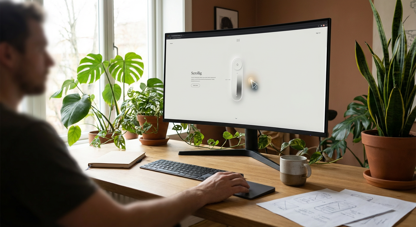
What Exactly Are Micro-Animations, and Why Do They Matter?
Simply put, micro-animations are small, functional animations that enhance the user experience by providing visual feedback, guiding attention, and adding a touch of personality. They're the subtle zoom on a product image, the satisfying checkmark after a form submission, the gentle fade of a new content block.
They’re not there to distract. They’re there to clarify, to humanize, and to delight. They answer questions the user hasn’t even consciously asked yet, like "Did that click register?" or "Where did that new item go?"
In a world of diminishing attention spans, these small movements are critical. Nielsen Norman Group, the titans of UX research, consistently emphasize the importance of immediate feedback. Micro-animations nail this, without requiring a complete design overhaul or sacrificing page load speed.
The Psychology of the Subtle: Why We Can’t Resist a Good Wobble (or Fade)
It’s not just about looking pretty. There's real psychology at play here. Our brains are hardwired to notice movement. It’s an evolutionary survival mechanism. While your website isn't chasing prey, that primal instinct translates into a deeper level of engagement with dynamic elements.
Consider the principles of Gestalt psychology. Proximity, similarity, continuity – these are all enhanced and made more intuitive through thoughtful animation. A user is more likely to perceive a series of steps as connected if there’s a smooth transition between them, rather than an abrupt cut.
Micro-animations also tap into our desire for instant gratification. When we click a button, we expect something to happen immediately. A subtle animation confirms the action, reassures us, and reduces cognitive load. This reduces frustration and increases the likelihood of a user completing their intended action.
"Good design is like a refrigerator — when it works, no one notices. But when it doesn't, it stinks." - Irene Au, former Head of User Experience at Google.
Micro-animations are the silent hum of a perfectly functioning refrigerator. You might not consciously notice them, but you’d feel their absence.
Beyond the "Wow" Factor: Tangible Benefits for Your Bottom Line
Let's talk brass tacks. Pretty pixels are nice, but they need to translate into profits. The beauty of strategic micro-animations is that their impact is measurable. We're not throwing spaghetti at the wall here; we're deploying a precision tool.
- Increased User Retention: A more engaging experience means users spend more time on your site. More time equals more opportunities for conversion.
- Reduced Bounce Rates: When a site feels alive and responsive, users are less likely to hit the back button out of frustration or boredom.
- Improved Usability & Navigation: Animations can guide the eye, highlight important information, and clarify complex processes, making your site easier to use.
- Enhanced Brand Personality: Subtle animations can inject personality and uniqueness into your brand, making it more memorable and distinct from competitors.
- Higher Conversion Rates: By streamlining user journeys and providing clear feedback, micro-animations gently nudge users towards desired actions, whether it's filling out a contact form or making a purchase.
Think about a typical e-commerce experience. Adding an item to a cart that visually "flies" into the cart icon provides instant feedback and a sense of accomplishment. It’s a tiny reward that encourages more interaction, leading to more conversions.
Where to Deploy Your Animated Artillery (Without Going Overboard)
The key to mastering micro-animations is restraint. Like a perfectly seasoned dish, a little goes a long way. Overdo it, and your site transforms into a dizzying carnival ride, leading to frustration and, yes, higher bounce rates.
Here are some prime opportunities for strategic deployment:
- Button & CTA Feedback: A subtle glow, a slight pop, or a gentle push effect when a button is clicked confirms the action and makes the interaction feel more substantial. Think about a "Submit" button that subtly shrinks and then expands with a checkmark.
- Form Field Interactions: When a user clicks into a form field, the label could float above it, or the input box could subtly expand. This makes forms less intimidating and more intuitive.
- Navigation Menus: Smooth transitions when opening or closing a menu, or subtle highlights on hover, make navigation feel fluid and responsive.
- Loading States: Instead of a generic spinner, a custom, branded loading animation can turn a moment of waiting into an opportunity for brand reinforcement.
- Notifications & Alerts: A gentle bounce or fade-in for a success message or an error alert ensures it catches the user's eye without being jarring.
- Product Image Hovers: Zooming, revealing additional details, or a quick rotation on hover for product images can significantly enhance the shopping experience.
- Scroll-Triggered Reveals: As a user scrolls, key elements (like testimonials or feature blocks) can gracefully fade or slide into view, adding a dynamic feel to the content. This is particularly effective for showcasing the depth of your custom web design capabilities.
The tools for implementing these are more accessible than ever. CSS transitions and animations are browser-native and incredibly efficient. For more complex interactions, JavaScript libraries like GreenSock (GSAP) or Framer Motion provide robust solutions without bogging down your site.
The FunnelDonkey Approach: Precision, Purpose, Performance
At FunnelDonkey, we don't just sprinkle animations on your site like glitter. Every movement is meticulously planned, serving a specific purpose. We analyze your user journeys, identify pain points, and then strategically introduce micro-animations to alleviate those frustrations and amplify delight.
Our process is far from generic. We understand that a local business in St. George, Utah, has different needs and a different target audience than, say, a national e-commerce brand. That's why our custom web design solutions are, well, custom. We consider everything from your brand voice to your conversion goals.
We’ve seen firsthand the power of these small details. One client, a B2B SaaS company, saw a 25% increase in demo requests after we implemented subtle micro-animations on their pricing page and contact forms. Another, a local service provider, experienced a 30% jump in call-back requests when their key service offerings gently animated into view upon scroll.
It's about making your website feel intuitive, premium, and inherently trustworthy. It's about turning a passive viewer into an active participant. It's about leveraging the subtle to achieve the significant.
The Perils of Over-Animation: Don’t Make Your Site a Disco Inferno
A word of caution, because we’ve all seen it. The website that looks like it was designed by a caffeinated squirrel on roller skates. Flashy, distracting, and utterly counterproductive. This is not the goal. This is what gives animations a bad name.
The cardinal rule: animations should enhance, not distract. If an animation draws attention away from your core message or slows down the user, it’s doing more harm than good. Think subtle, swift, and seamless. Avoid:
- Excessive Movement: Not everything needs to animate. Keep it focused on key interactive elements or content reveals.
- Slow or Laggy Animations: If an animation takes too long to execute or causes performance issues, it will frustrate users. Smoothness is paramount.
- Unnecessary Complexity: Don't animate just because you can. Every animation should have a clear purpose – to provide feedback, guide attention, or build brand personality.
- Inconsistent Styles: Maintain a consistent animation language across your site. Jumpy animations in one section and smooth fades in another create a disjointed experience.
It's about finding that sweet spot, that perfect balance between engaging dynamism and effortless usability. This is where the expertise of a seasoned web design agency truly shines. We know how to wield these tools like scalpels, not sledgehammers.
Measuring the Impact: Proving the Power of Pixel Perfect Movements
How do you know if your micro-animations engagement strategy is actually working? You measure it. This isn't just about gut feelings; it's about hard data.
We leverage analytics tools like Google Analytics, Hotjar, and custom event tracking to monitor user behavior. We look at:
- Bounce Rate: Is it decreasing?
- Time on Page/Site: Are users spending more time engaging with your content?
- Conversion Rates: Are more visitors completing your desired actions (form submissions, purchases, downloads)?
- Scroll Depth: Are users interacting with more of your page content, especially the elements that animate into view?
- A/B Testing: We can test different animation styles or the presence/absence of animations to see which performs better for specific goals.
For example, if we introduce an animation for a call-to-action button, we'd track the click-through rate on that button before and after implementation. If the rate jumps from, say, 5% to 8%, that's a tangible, measurable improvement. We can even help you estimate the potential ROI with our handy ROI calculator.
This data-driven approach is fundamental to everything we do, whether it's optimizing your site for local SEO in St. George or crafting an internal linking strategy that boosts rankings across multiple locations, including SEO in Cedar City. We don't guess; we test, refine, and optimize.
The Future is Fluid: Staying Ahead of the Curve
The web is an ever-evolving beast. What's cutting-edge today is standard practice tomorrow. Micro-animations, while not new, are continually evolving in sophistication and accessibility. Tools are becoming more intuitive, browser support is more robust, and user expectations are rising.
Staying ahead means more than just knowing the latest design trends. It means understanding the underlying principles of user experience and human psychology. It means being able to discern between fleeting fads and enduring strategies that genuinely enhance engagement and drive conversions.
We're constantly researching, experimenting, and refining our approach. Because for your business, "good enough" is never good enough. You deserve a website that doesn't just exist, but thrives. A website that works tirelessly to attract, engage, and convert your ideal customers.
We've already talked about how to write service pages that actually convert and how to repurpose one blog post into five pieces of content. These are all pieces of a larger puzzle – a cohesive digital strategy designed to dominate your market.
If your website feels static, if your engagement metrics are flatlining, if your conversions are lackluster, it’s time for a change. It’s time to move beyond pretty pictures and bland text. It’s time to infuse your digital presence with life, purpose, and the undeniable power of well-executed micro-animations. Stop settling for a website that just sits there. It’s time to command attention, differentiate your brand, and turn browsers into buyers. Ready to build a website that doesn’t just exist, but performs? Connect with the FunnelDonkey team today and let’s talk strategy. Visit our contact page or explore our pricing to see how we can transform your digital presence.