The Thank You Page: Your Most Wasted Opportunity
Don't let your thank you page be a sales ghost! Turn that post-purchase moment into a conversion machine with FunnelDonkey.

The Thank You Page: Your Most Wasted Opportunity
So, you’ve done it. You’ve convinced a digital stranger to part with their precious information or, dare we say, their hard-earned cash. They clicked, they landed, they converted. Victory! Except… what happens next? If your answer is a generic “Thanks for your order!” on a page that looks like an afterthought, then congratulations, you've just squandered one of your most potent post-conversion assets.
In the thrilling, often bewildering world of online business, we pour blood, sweat, and tears into attracting eyeballs and coaxing them into taking action. We obsess over landing page copy, ad creatives, and the subtle art of the call-to-action. But then, when the deed is done, the digital equivalent of a handshake and a polite nod is often all the fanfare our newly minted leads or customers receive. It’s like throwing a party and then immediately kicking everyone out into the rain without offering them a warm drink or a chance to mingle.
Let’s be crystal clear: your thank you page isn't just a digital formality. It's a prime piece of real estate, a second (or third, or fourth) chance to engage, delight, and steer your audience toward the next logical step in their journey with you. Ignoring it is akin to leaving money on the table, and frankly, it’s just bad business.
Why Your Current "Thanks" Is Probably Sinking
We see it all the time. Small businesses, especially those who've cobbled together a website on do-it-yourself platforms like Wix or Squarespace, often treat the thank you page as an endpoint. It’s the digital equivalent of hitting "save" and closing the file. This attitude is a glaring red flag.
Consider the user's mindset at this precise moment. They’ve just committed. They’re feeling validated, possibly excited, and definitely open to what you have to say next. They've established a connection, however brief. And what do they get? A page that often:
- Offers no clear next steps.
- Is devoid of branding or personality.
- Looks nothing like the rest of your website.
- Does little to reinforce their decision or build excitement.
- Is a dead end, forcing them to navigate back or guess what to do next.
This isn't just lazy; it's a strategic blunder. Think about it: if you just bought something cool, would you want to be immediately dumped onto a screen that screams "Mission Accomplished, Now Go Away"? Probably not. You’d appreciate a little acknowledgment, maybe a hint of what’s coming next, or even a suggestion for something else you might like.
Even more sophisticated businesses, those who’ve moved beyond the beginner realms of GoDaddy website builders, can fall into this trap. They have a process, but the thank you page is an afterthought, an unoptimized rung on the conversion ladder.
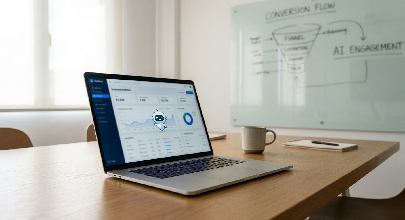
The Post-Conversion Goldmine: What's Actually Happening
When a user converts, whether it’s signing up for a webinar, downloading an ebook, or making a purchase, their engagement levels are at an all-time high. They’ve actively chosen to interact with your brand. This isn’t passive browsing; this is a deliberate action. And that makes them a remarkably receptive audience.
Your thank you page, or confirmation page as it's often called, exists in a sweet spot: the user is still warm, their intent is clear, and they are actively looking for guidance or further interaction. This is your chance to:
- Reinforce their decision: Make them feel good about what they just did.
- Set expectations: Let them know what happens next and when.
- Build anticipation: Hint at the value they're about to receive.
- Nurture the relationship: Guide them toward the next logical step.
- Gather more information (strategically): If appropriate, use this moment for further engagement.
This isn't about bombarding them with spam. It's about thoughtful, strategic engagement that respects their journey and leverages their current mindset. It's about turning a simple transaction into the start of a valuable relationship.
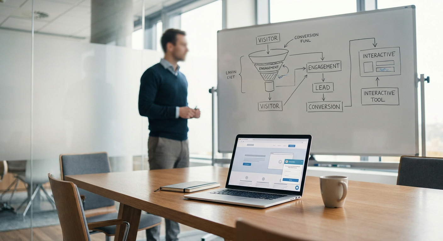
From Transaction to Transition: Optimizing Your Conversion Path
Think of your website not as a series of isolated pages, but as a connected journey. Each touchpoint should seamlessly lead to the next. Your thank you page is a critical part of this transition. It bridges the gap between initial action and ongoing engagement.
So, how do you transform a dull confirmation page into a powerful conversion tool? It starts with understanding the mindset of your user and what *they* need next.
For a Lead Magnet Download
Someone just downloaded your ultimate guide to growing their business. Great! What’s next?
- Immediate Access: Provide a clear, clickable link to their downloaded material. Don't make them hunt for it in their inbox.
- What to Expect Now: "You'll also receive a follow-up email with tips and resources in the next 24 hours."
- Next Logical Step: "Ready to dive deeper? Explore our [pricing packages](/pricing) to see how we can accelerate your growth." Or, "Join our free Facebook group for more actionable marketing advice."
- Social Proof: Link to a testimonial or a case study that reinforces the value of your content.
For a Product Purchase
They just bought a tangible (or digital) product from you. They’re excited!
- Order Confirmation Details: Clearly display order number, items purchased, total cost, and shipping address (if applicable).
- Shipping/Delivery Expectations: "Your order will ship within 2 business days. You'll receive a tracking number via email."
- Build Brand Loyalty: "We're thrilled to have you join the [Your Brand Name] family! Follow us on [social media link] for behind-the-scenes content and special offers."
- Upsell/Cross-sell (Subtly): "Customers who bought this also loved [related product]." Or, "Here are some accessories that pair perfectly with your new purchase."
- Customer Support: Make it easy to find contact information for questions or issues.
The key here isn't to cram everything onto one page. It's to provide the essential confirmation *and* strategically guide them towards continued engagement.
Beyond the Basic Confirmation: Advanced Thank You Tactics
Once you’ve nailed the basics – confirmation, next steps, and brand reinforcement – you can start thinking about how to wring even more value out of this often-neglected page.
The "Did You Know?" Section
This is where you can plant seeds for future interest or address common objections.
- Highlight a Key Feature: Briefly mention a benefit of your service or product they might not have considered yet.
- Link to Relevant Content: If they just signed up for a free consultation, link to a blog post on "What to Expect During Your Consultation." If they bought a specific product, link to a guide on "Getting the Most Out of Your [Product Name]."
- Introduce a Related Service: "While we're getting your [product/service] ready, did you know our [SEO services](/services/seo) can help you attract even more customers?"
The Social Proof Power-Up
Confirmation pages are an excellent place to build trust and credibility. They’ve already trusted you enough to convert, so they’re more open to seeing that others have too.
- Star Ratings or Testimonial Snippets: A quick quote from a satisfied customer can go a long way.
- Link to Reviews: Direct them to a reputable review site (like Google Reviews) where they can see your overall fantastic reputation.
- "Join X Thousand Happy Customers": A simple statement about the size of your community can be surprisingly powerful.
The Invitation to Deeper Engagement
Don't let their journey end here. Think about the next logical step in their relationship with your brand.
- Invite to a Webinar: "While you wait for your download, sign up for our upcoming webinar on [topic]."
- Encourage Social Sharing: "Love what you just got? Share it with your network!" (Use social sharing buttons.)
- Request a Feedback Survey (Carefully): Only do this if it's brief and truly valuable for you. A tool like SurveyMonkey or Typeform can make this easy.
Remember, the goal is to be helpful and relevant, not overwhelming. Each element should serve a strategic purpose in nurturing the customer relationship.
The CTA That (Actually) Converts Again
The primary call-to-action on your original landing page was to get them to convert. Your thank you page needs a *secondary* call-to-action. This is where you guide them to the next step in their journey with your brand.
What does that look like? It depends entirely on your business model and the user’s goal.
- For B2B Services: "Ready to see how we can transform your business? Explore our [pricing packages](/pricing) or use our [cost estimator](/tools/cost-estimator) for a personalized quote."
- For E-commerce: "Continue shopping for more [product category] or browse our new arrivals."
- For Lead Generation: "Join our community! Connect with us on [social media links] and get exclusive content delivered straight to your inbox by signing up for our newsletter."
- For Educational Content: "Liked this? You'll love our advanced course on [topic]."
The key is to make this CTA clear, compelling, and contextually relevant to the action they just took. It should be easy to understand, visually prominent, and directly linked to the next logical progression you've designed for them.
Avoid generic CTAs like "Click Here" or "Learn More" unless they are exceptionally specific (e.g., "Learn More About Our Full-Service Packages"). The more refined and targeted your CTA, the higher the likelihood of it being clicked. Remember, they just said "yes" to you. Making it easy for them to say "yes" again is smart marketing.
Technical Nuances & Avoiding DIY Disasters
Even if you're using a platform that offers more robust features than the basic Wix or Squarespace templates, implementation matters. A poorly configured thank you page can be just as ineffective as a generic one.
Tracking & Analytics
This is non-negotiable. Your thank you page is your confirmation point for conversions. Ensure your analytics (Google Analytics, your CRM, etc.) are firing correctly on this page.
- Goal Completion: Set up the thank you page URL as a conversion goal. This tells you when a user successfully completes a desired action.
- Tracking Pixels: Ensure Facebook, LinkedIn, Google Ads, and other retargeting pixels fire here. These users are warm and valuable for future ad campaigns.
- Event Tracking: Set up event tracking for any specific clicks on your thank you page, such as clicking to download a resource or going to a product page.
Mobile Responsiveness
If your thank you page looks clunky or is difficult to navigate on a mobile device, you’re turning away a significant portion of your audience. Test it rigorously on different screen sizes. A clunky mobile experience on a confirmation page is a swift way to erode trust.
Branding Consistency
This cannot be stressed enough. Your thank you page should look and feel like the rest of your website. If it’s suddenly a stark white page with black text and a generic logo, it screams "afterthought." Ensure consistent:
- Colors
- Fonts
- Logo
- Overall design aesthetic
Avoid Them-All Errors
Don’t fall into the trap of adding excessive links, overwhelming buttons, or generic boilerplate text. Every element on your thank you page should have a purpose. If it doesn't directly contribute to reinforcing the conversion, setting expectations, fostering trust, or guiding the user to the next step, remove it.
Building a truly effective thank you page requires more than just ticking a box. It requires strategic thinking and a commitment to optimizing the entire customer journey, from first click to loyal advocate. Don’t let this prime piece of virtual real estate go to waste.
---Ready to Stop Wasting Your Thank You Pages?
Your website is more than just a digital brochure; it's your hardest-working salesperson. If your thank you pages are currently performing like a ghost town, it's time for a serious upgrade. At FunnelDonkey, we don't do generic. We build strategic websites designed to convert, delight, and keep your customers coming back for more.
From optimizing your post-conversion flow to ensuring every touchpoint serves your business goals, we’re the brutally honest, results-driven agency you need. We’ll help you turn those "thanks" into tangible next steps that fuel your growth.
Don’t let your missed opportunities pile up. Let’s build a website that works as hard as you do.