The Grid System Explained for Non-Designers
Unleash the power of the grid! Your go-to guide for making *anything* look legit, even if you think "kerning" is a type of yogurt.
November 6, 2025 6 min read

Tired of Websites That Look Like They Were Designed by a Drunk Squirrel? Let's Talk Grids.
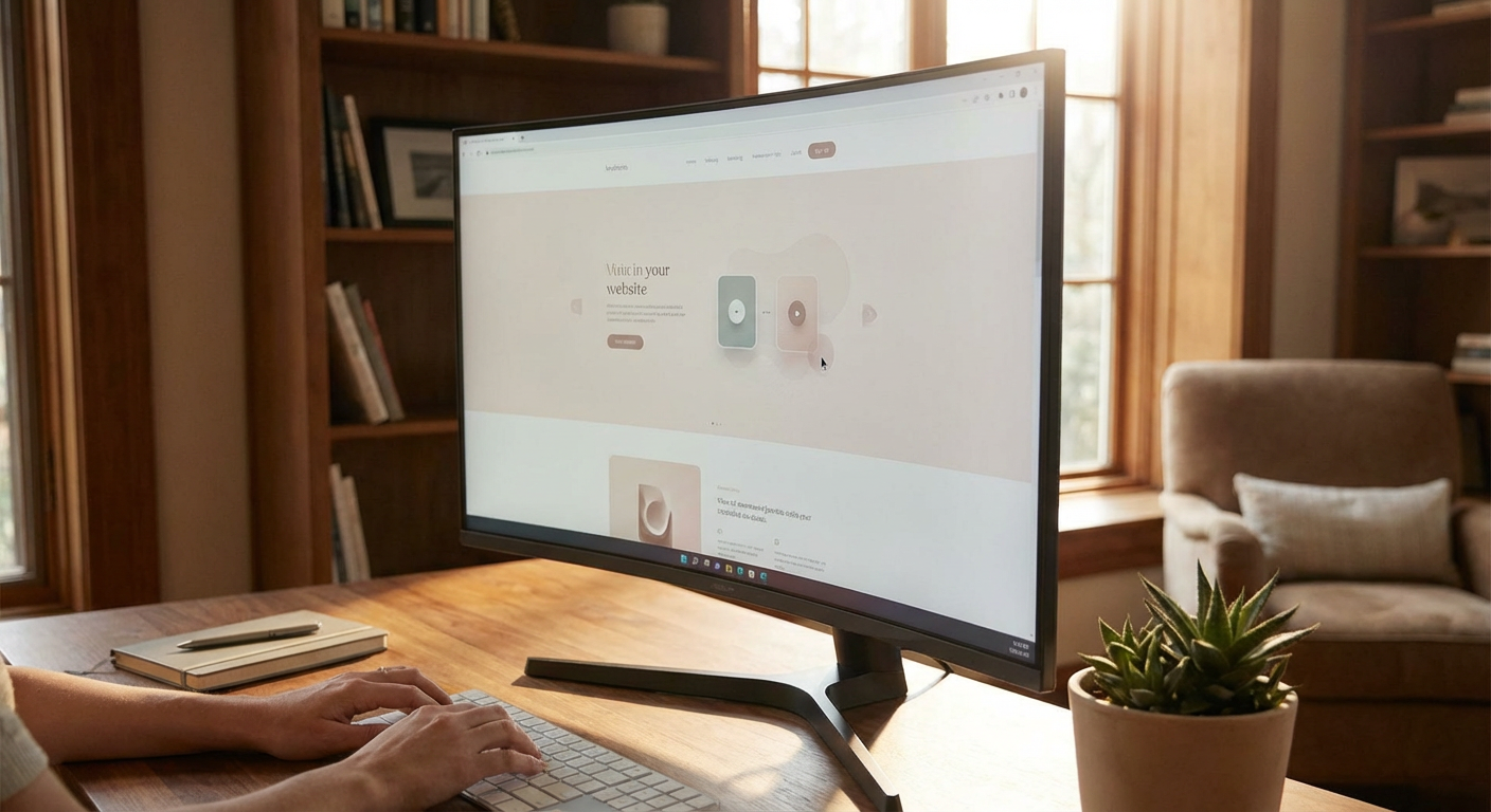
You’ve seen them. The digital equivalent of a Jackson Pollock painting gone wrong – elements scattered haphazardly, text crammed into impossible corners, images appearing out of nowhere. It’s enough to make your eyes water and your potential customers click away faster than you can say “bounce rate.” But what if I told you there’s a secret sauce, a cosmic blueprint that separates the beautifully structured websites from the chaotic visual messes? It’s called the grid system, and understanding it is your first step to a website that doesn't just look good, it *works* good.What in the Web Design Blazes is a Grid System?
Forget art school jargon. A grid system, in plain English and without the pretentiousness, is simply a structure of horizontal and vertical lines used to organize content on a page. Think of it like the faint lines on your notebook paper, or the lines on a basketball court. Its purpose isn't to imprisonate your design, but to give it order, consistency, and clarity. Without a grid, your website elements are just floating aimlessly, like dropped Jell-O. With one, they sit purposefully, guiding the user’s eye and making your information digestible. For us mere mortals who aren't fluent in Photoshop curves, it’s the invisible scaffolding that holds up a stunning online presence.Why Your Website *Needs* a Grid (Even if You Think It Doesn't)
Let’s be brutally honest. Most websites built on drag-and-drop platforms like Wix, Squarespace, or GoDaddy are a free-for-all. They *allow* you to throw anything anywhere, and guess what? Most people do. This leads to:- Visual Clutter: Too much information crammed together without a hierarchy.
- Inconsistent Spacing: Elements feeling too close to each other or too far apart, creating an unbalanced feel.
- Poor Readability: Text blocks that are too wide or too narrow, making it a chore to read.
- Lack of Visual Appeal: A general sense of “off-ness” that screams amateur hour.
Breaking Down the Grid: Columns, Gutters, and Margins
Before we get too deep, let’s define the key players in the grid system game:Columns
These are the vertical divisions that make up your grid. Think of them as the main vertical lanes on your digital highway. Most web grids use 12 columns, which offers incredible flexibility. Why 12? Because it’s divisible by 2, 3, 4, and 6, meaning you can easily create layouts that split the page into halves, thirds, quarters, or sixths. This is the magic behind those clean, multi-column layouts you admire.Gutters
These are the spaces *between* your columns. They provide breathing room and prevent your content from feeling cramped. Imagine them as the little pathways between rows in a stadium seating; they’re essential for separating distinct sections without losing overall flow. The width of your gutters is a crucial design decision that impacts the overall tightness or looseness of your layout.Margins
These are the spaces on the *outside* of your grid. They frame your content and create a buffer between your design and the edge of the screen. Like the frame around a painting, margins give your work context and prevent it from feeling overwhelming. Consistent margins across your site contribute significantly to a professional look and feel.CSS Grid: The Modern Powerhouse for Layout Design
Gone are the days of relying on hacks and workarounds (we’re looking at you, floats!) to build complex web layouts. Enter CSS Grid Layout, a modern CSS module specifically designed for creating two-dimensional layouts. It’s a game-changer for web designers and developers, offering unprecedented control and simplifying the creation of sophisticated designs that were once a nightmare to implement. When we talk about a grid system on the web, we're almost always referring to how it's implemented using CSS Grid. This isn’t some abstract concept; it's a tangible set of CSS properties that allow us to define our grid structure, place items within it, and control their alignment.CSS Grid vs. Flexbox: A Friendly Rivalry
You might have heard of Flexbox. It’s a fantastic tool for laying out items in a single dimension (either a row or a column). Think of it as perfect for aligning navigation items, distributing space within a card, or creating a responsive button group. However, CSS Grid is built for two-dimensional layouts – rows *and* columns simultaneously. This makes it the superior choice for defining the overall structure of your website page. * **Flexbox:** Great for distributing items along a single axis (row or column). Ideal for components. * **CSS Grid:** Excellent for defining the overall page structure, creating major content areas and complex relationships between rows and columns. While they can work together, understanding their strengths helps you leverage the best tool for the job. Using CSS Grid for your main page layout and Flexbox for finer control within those grid areas is a common and powerful approach.The Usability Advantage: Making Your Website a Breeze to Navigate
A well-implemented grid system isn’t just about aesthetics; it’s a fundamental pillar of good user experience (UX). When content is organized predictably and consistently:- Users can find what they need faster. Think of it as clear signage in a busy department store.
- Cognitive load is reduced. Users don't have to work hard to understand the layout.
- Trust is established. A professional, organized website signals reliability and competence.
- Conversions increase. When users can easily navigate and find information, they’re more likely to take action.
Designing for Different Devices: Responsiveness and the Grid
The beauty of a CSS Grid system is its inherent flexibility, making it a dream for responsive web design. As screen sizes change (from a massive desktop monitor to a tiny smartphone screen), your grid can adapt. * **Flexible Grids:** You can define grid tracks (columns and rows) with relative units (like percentages or `fr` units) that automatically adjust to the available space. * **Media Queries:** These are standard CSS tools that allow you to apply different styles based on screen size, orientation, or resolution. You can use them in conjunction with CSS Grid to fundamentally change your grid's structure for different devices. For example, a layout that uses 12 columns on a desktop might collapse into a single column on a mobile device. * **Content Reordering:** CSS Grid offers powerful properties like `order` that allow you to visually reorder content on different screen sizes without changing the underlying HTML code. This is invaluable for prioritizing content on smaller screens. While platforms like Squarespace might offer some responsive features, they often do so with a "one-size-fits-most" mentality. A custom-built grid system allows for highly tailored responsiveness that truly caters to your specific content and audience, regardless of their device.When to Break the Grid (And How to Do It Without Chaos)
No, we’re not advocating for a return to the digital wild west. But even the most beautiful structures need moments of visual intrigue. Breaking the grid intentionally can add personality, highlight key information, and prevent your design from becoming too rigid. * **Emphasis:** A large, full-width image or a prominent call-to-action can intentionally span across multiple grid columns to grab attention. * **Visual Flow:** Sometimes, you might want an element to slightly break outside its defined grid area to create a more dynamic flow between sections. * **Storytelling:** For narrative-driven content, a full-bleed image or a strategically placed graphic might be more impactful than staying within the confines of the grid. The key here is intention. Breaking the grid should be a deliberate choice that serves a clear design purpose, not a random act of visual anarchy. When done correctly, it enhances, rather than detracts from, the overall design. It’s about knowing the rules so you can bend them gracefully.The FunnelDonkey Difference: Building Grids That Convert
Look, we could pontificate about grids all day. We could wax poetic about `display: grid` and `grid-template-areas`. But what does it *mean* for your St. George business? It means a website that’s not just visually appealing to your mom, but one that actually works to attract and convert customers. At FunnelDonkey, we don't just build websites; we build conversion machines. And at the heart of every conversion machine is a solid, well-thought-out structure. We leverage the power of modern CSS Grid and intelligent layout design to ensure your website:- Loads lightning fast (no bulky templates slowing you down).
- Looks incredible on every device (from desktops to phones).
- Guides your visitors effortlessly from awareness to action.
- Is easily expandable and maintainable as your business grows.
- Supports your other marketing efforts, like [local SEO](/services/local-seo).